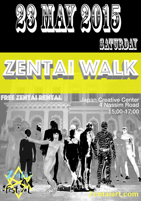
But it does not look fun and catchy
|
zoologics
18/2/2015 01:21:59 pm
Flat straight horizontal and vertical lines are visually stable (Bank Logo). Diagonals are better. Converging lines even better, they generate movement. Using more curves will make it look more soft. Play with size contrast in you elements. A big part of zentai is color... maybe try to paint flat color behind the lines so the look like a wood block print... Anyway got to run to work, sorry for the short message!
Reply
Your comment will be posted after it is approved.
Leave a Reply. |
Archives
June 2017
|


